Pages

Sunday, July 11, 2010

MARNI & the Mannequin

(Window photography by Rudy Pospisil)

The current windows on display in Bergdorf Goodman's Fifth Avenue facade celebrate the history of the mannequin.  The mannequin has evolved in shape, size, and purpose since its original inception in the 1570's as an artist's jointed model (showcased in the Goyard shadow box).  Mannequin forms were, and still are, created to meet their time's societal standards of beautiful perfection - languid necks, pouty lips, gazing eyes, wrought hair styles, skin colored with make-up, or skin blank as a painter's canvas.  Each window displays this history with vintage forms as well as the newest mannequin model used today, coined "the Schlappi", which is categorized by its a la mode slender limbs and posture. 
David Hoey, BG's famed Window Director, and his team masterfully set a collection of antique mannequins in front of various photographs by Rebecca Martinez, a San Francisco based photographer.  To prep for these windows, the Visual team had, over the span of six years, slowly acquired these forms, collecting them from wholesale outposts throughout the city and even bidding for them on eBay.  In her collection, "Beauty Challenged", Martinez captured images of decaying vintage mannequins.  As she explains in her artist's statement about this collection of photographs: "mannequins are exemplars of an idealized, unobtainable, youthful perfection...These cloned representations of society's ideal of beauty hold this status for a limited time."   Changing seasons usher in new perceptions of what is beautiful.  Much like last season's of-the-moment must-have fashion splurge, these mannequins are often tossed away and forgotten once they "become marked by usage and decay", just in time to purchase the latest model fresh off the racks.  When brought to our attention again in these windows and photographs, these mannequins become haunting relics of the past, reminders of our past societal ideals of beauty.  Once popular and celebrated for their perfect representation of the female form, they now gaze at us through the glass window with exhausted stares of aged irrelevancy. 
But, the strength in these window displays lies not in their depiction of the past, but rather in their commentary on the present.  Though our favored aesthetics may have changed over time, we still value the pursuit of beauty today in art, fashion, and culture.  In their own unique way, each of these mannequins serve as an exhibition of our best.  One can only know where we are going if we know where we've been.  And, from the looks of it, we've gone from a graphically, spotted vintage Libertine dress to its perfectly paired, abstractly patterned, olive Marni coat from the newly arrived Pre Fall collections on the 3rd Floor!
(Images courtesy of style.com)


Marni Shop, Bergdorf Goodman Women's Store, 3rd Floor

Sunday, June 27, 2010

The Mass of Christian Boltanski


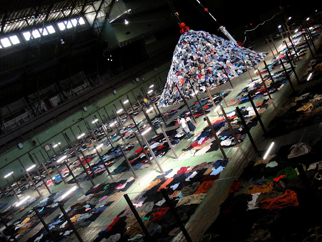
Entering the Park Avenue Armory drill hall in which Christian Boltanski’s latest installation No Man’s Land resides, the witness becomes aware of voice and the lack thereof.  I only assumed that the clothing strewn across the wooden flooring, organized into methodical layerings and barrack-like groupings, were leftovers—remnants of people long gone and forgotten.  The massive exhibition with its massive piles of donated, used clothing suggests an idea of commercial deadness, of an intrinsically cultural deadening spanning thousands, if not millions, of represented bodies.  The shear number of accumulated articles of clothing indicates that mass is dead.  That which lives is the opposite of mass: the unique person who walks into the exhibit and leaves with an expression and thought.  You become the only life.  And the haunting echoes of accumulated heartbeats serve as a piercing reminder.


Monday, June 7, 2010

Givenchy In Action

(Images from style.com)


Wednesday, June 2, 2010

Concrete Jungle, May 2010

Friday, May 7, 2010

Too Big to Fail


(Balenciaga images from style.com)

Julie Mehretu's subject matter - the history of finance capitalism - in "Mural" is abstracted in layers of architectural drawings, map renderings, trade routes, population shifts, and figural representations of financial institutions.  She was commissioned by Goldman Sachs to create this work for the lobby of their building, which runs parrellel to the West Side Highway in Battery Park.  One can peer directly inside the lobby via the building's large glass windows, while also catching a glimpse of one's own reflection on the mirrored glass surface.  This imposes a shadow upon Mehretu's work, as if one's shadow becomes a part of the painting -- a looming, figural abstraction of one's own history. 

For Fall 2010, Nicolas Ghesquière for Balenciaga aimed "to ennoble everyday domestic objects" by using interesting and unidentifiable materials and textures.  They recalled tubing, plastic bubble wrap, newspaper and magazine print, styrofoam, neoprene, electrical wiring, stacked boxes, raked fallen leaves, egg cartons, metal fencing, and air condition filters.  Though, through the lens of Ghesquière, these materials were employed not so much in the surreal or found object mode but rather through a futuristic vision with inventive cuts and boxy silhouettes. 

In a season about the strength of women, it is radical to see this sort of translation on the runway -- household objects of the domesticated housewife, which one might think is distant from the independence and individualistic ideas shown through other designers' menswear and utility references.  But, if one uses Mehretu as a point of reference, one can understand that Ghesquiere uses these materials in order to show a history (and in this case, the history of women's suppressed containment in the home). It is as if doning domestic household products on one's clothing is to don one's acknowledgement of the past in order to proceed to the future. 

As Mehretu created a visual history for Goldman Sachs (let's not forget that she is a female artist illustrating the economic history of a predominantly male world), so too does Ghesquière for women via a satirical commentary about the strength of women, who are strong enough -- and witty enough -- to wear the remnants of their oppressed and gendered past as fashion. 

(Detail of Julie Mehretu's "Mural", 2007 - image from The New Yorker)

Wednesday, May 5, 2010

American Women

(Images from style.com)

The annual Metropolitan Museum of Art's Costume Institute Gala was held this past Monday, May 3rd.  Everyone in the industry was a-buzz the week prior and even up to the last minute, trying to figure out what to wear to what has been the most vague theme in some years now: American Woman:  Fashioning a National Identity.  "American woman" can mean many things, but Vogue/Met narrowed it down to the era between the 1890s and the 1930s, including five distinct categories:  "The Gibson Girl", "The Bohemian", "The Screen Siren", "The Flapper", "The Patriot", "The Suffragist", and "The Heiress", all corresponding to their respective decade. 

How did the crowd turn out?  Well, it has been my opinion (and many others in the industry, as well) that most of the red carpet starlets just didn't "get it" this time around.  It is hard to pinpoint the most appropriate look for the evening when such diversity exists within its theme.  How do you balance vintage American fashion with today's fashion?  Do you go full on vintage in a Charles James 30's couture frock or do you don a Poiret-inspired Halston Heritage dress (a la Sarah Jessica Parker)?  Should you stay in the confines of American designers, past and present, or break out into the world of designers all together?

We are all fully aware that many of these stars (and industry execs) do not solely choose their own looks; extensive research from celebrity stylists on available samples coupled with artistic collaboration with hair and makeup teams ultimately bring together the final look.  So, how much of what we see is truly the expression of the woman behind all of this outsourced effort?

It would be most obvious to me that the phrase "American Woman" would translate into a theme to stay true to what it means to be an American woman: to express yourself regardless of constraints or preconceived notions.  This may have been too much for most stylists to handle--to allow the girl behind the makeup to express her own opinion.

(Images from style.com)

That being said, the ones who did get it right looked relevant and radiant. They chose the Spring 2010 trends as their focus, most prominently seen in Fendi's Spring show. After all, SS 2010 was about la femme revealed, unobstructed and bare, showcasing the woman underneath her clothing (both physically and personally) as the true expression of her own beauty—the very facet of real American feminist ideals. All of this was enhanced by nude palettes emulating supple skin color, transparency and lightness of fabrics, and lingerie detailing. The in-trend nude palette was the most interesting of the night with its sun-kissed shimmer and shine, while the a la mode soft, billowy Grecian silhouettes offered a subtle "vintage" reveal of the feminine form underneath.

Monday, May 3, 2010

Missing In Action

(Still from The Hurt Locker, 2009 - Image from allmoviephoto.com)


M. I. A.'s new video for her song "Born Free" brings an uncensored light on man's superficial condition. In the midst of war, oil disputes, and irrational othering of immigrants and foreigners, to be "Born Free" begs the questions: "to be born free of what? of superficial judgement?"


In a society that is obsessed with style, superficial judgement is the name of the critiquing game.  Style is defined as the newest and the most inventive, the most shocking and statement-making, usually reserved for the "it" moment girl or outlandish celebrity.  "All this leads to the narrower type of intellectual individuation . . . the strangest eccentricities, to specifically metropolitan extravangances of self-distanciation . . . in its being a form of 'being different' -- of making oneself noticeable" (George Simmel, Individuality and Social Structure, 1971).  The media has diluted style down to its ability to draw attention.  We have forgotten that style is not just mere removable and interchangeable facades.  It is an expression and admission of a statement; it is a mission to say who we are upon first glance -- instantaneous personality. 


Fashion trends are nothing more than a grouping of such style missions by designers, some more poignant than others. The military trend that has been so prevalent throughout designer collections for the past couple of years was originally aimed at addressing our reflective support of justice.  This feeling eventually turned into our eventual disgust and angst.  The blasé attitude that we have recently felt in the pangs of our economic downturn is slowly disseminating, as confidence in a new age is rising.  We no longer wear the face of righteous revenge, we wear the strength of man's perserverance.  Designers have reflected this societal shift, from the post 9/11 collections of Marc Jacobs and Calvin Klein to the now clean and minimal evolutions of Phoebe Philo's Celine and of Reed Krakoff, who both tip a hat to strength in menswear references.

(Images from style.com and NY Magazine)


M. I. A.'s true genius lies in her ability to transform the music video genre, stylistically combining cinema and emotive soundtrack.  The video creates a hyper reality of grainy documentation, and the music only plays to it.  It is as if M. I. A. places an emphasis on her message and storyline over her own medium of music.  This cross-over categorizes modern artistic expression where photographers are becoming filmmakers and musicians are becoming directors.  M. I. A. answers: "With a nose to the ground, I found my sound."  


How then do we explain the context of the video below?  In my mind, it is completely out-of-sync with the world we are living in today (and more importantly the world where designers are influenced) because it has no style.  Its only message echoes irrelevant, past glamour; nineties raw sex was forgotten years ago.  Designers have progressed.  Can the rest of us evolve already?


Sunday, May 2, 2010

"When hedonism was chic." - Whitney Sudler-Smith, Director of Ultrasuede: In Search of Halston (2009)


The world premiere of Ultrasuede: In Search of Halston was held during the TriBeCa Film Festival this past Friday, April 30th.  The industry was well in attendance with the likes of Marc Jacobs, Lorenzo Martone, Naeem and Ranjana Khan, Linda Fargo, Amy Fine Collins, Cathy Horyn, and the actress-turned-Halston-Heritage-designer Sarah Jessica Parker.  The post film forum panelists included Halstonette Pat Cleveland, heir apparent Ralph Rucci, Vogue's André Leon Talley, the movie's director Whitney Sudler-Smith, and Valentino: The Last Emperor director Matt Tyrnauer.

While I would have loved to see more Halston vintage samples worn (especially on a gloriously summer night where caftans would have been apropos in true form), I am glad that Pat Cleveland decided to wear the most relevant, SS10 Marc Jacobs-esque, iridescent purple pant suit with flanked, cascading ruffles.  Though her rather senile dialogue during the forum was an all too familiar reminder of the effects of 70's social habits, she did represent a time gone by which was refreshing to the conversation.  Highlights of her wild speech included her "moth" analogies present in the movie and in her forum attempt at describing Halston's legacy of movement in clothing.  This included her trying to dance while tied down by her lapel mic.  "The moth is caught!", she cried, while flapping the ruffles as wings.

The movie was enjoyable and will overall contribute to the genre of the fashion documentary.  But, the point-of-view is faulted due to its seemingly fanatical, infallible portrayal of Roy Halston Frowick.  The generalized notion of Halston's reign in the 70's neglects the story of his downfall via addiction.  This film slightly covers it at the conclusion, but fails to elaborate on its importance to Halston's legacy.  Ralph Rucci, in his forum dialogue, seemed to be starkly opposed even to the mentioning of the drug addiction, insinuating that it taints the memory of Halston.  I beg to differ, as it only supports his legacy of balanced extremism.

I say "balanced extremism" because what worked in the 70's was Halston's ability to live and create extremes--extremes that are both symbiotically linked in a delicate balance of excess and simplistic purity.  His life was full of hedonistic indulgences of Studio 54, Andy Warhol, Liza Minelli, and Victor Hugo, yet his design focus was luxurious, global minimalism--a direct contrary to the opulence of million dollar orchid arrangements that inhabited both his abode and atelier.  His designs were direct reactions to his own life; they were escapes to purity.  It is only when these two modes were in balance that Halston was able to exist.  Once the indulgent nightlife and habits took hold, the purity vanished.

This is Halston's legacy: the legacy of the frail human condition on beauty.


(Images from life.com and NY Magazine)

Tuesday, April 27, 2010

"On ne naît pas femme: on le devient." - Simone de Beauvoir, Le Deuxième Sexe (1949)


(Images from allmoviephoto.com and NY Magazine)

Monday, April 26, 2010

RECETTE...tative?

In this week's NY Magazine, Adam Platt reviewed the new Recette on Greenwich Street (a hop, skip away from the Martin Margiela boutique). "By the time the third dish arrived (a deliciously soft block of halibut, set over a creamy morel sauce), I felt like an opera buff who’d stumbled on a group of world-class tenors singing arias in their garage." Could Adam be referring to tenor Roberto Alagna in the Met’s newest production of Carmen? Playing Don Jose this past season, it was my first time hearing Alagna live; to my greatest delight, his tonality reminded me of a young Luciano Pavarotti.

(Pictured above: the army barracks scene from Act I - images from NY Times)

Also starring the staggering Elina Garanca in the title role, this innovative production by Richard Eyre was the most contemporary and relevant Carmen that I have seen to date (I have waited for a production to deem Zeffirelli's passé and out-of-touch version obsolete; Eyre’s just might do the trick). In his sets, far from a derelict garage, Eyre wove the apropos metaphor of a red ripped slash throughout: the violent lightning bolt that carves the stage curtain, the morphing silhouette of the rotating set, and the appliqué on Carmen's final gown. The latter, however, was not the most ingenious use of the metaphor, as it made the soprano look like a walking embodiment of the curtain.

(Images from NY Times)

Carmen's final garb is the symbol of the conclusive disparity that resides within Carmen herself: a recluse, passionate lover and arbiter of selfish control.  Dolce & Gabbana's transparent, lace dress with opaque undergarment-maillot would serve as an example of such contemporary manipulation of duality in fashion; while the silhouette is drawn from classical conservatism, the reveal of the woman underneath speaks to her undressed personality.

(Images from NY Times and NY Magazine)

Getting back to Recette; while I found it appealing, homey and quaint with refined French offerings that reminded me of food that your French grandmother could make, it didn't quite live up to Platt's applauding review. I started with the Cod Fritters, which were disappointingly overly breaded, and proceeded to the Daurade with sunchoke puree. While the Daurade was rather flavorless, I did sneak a taste of my mother's Halibut in a saffron beure blanc sauce (and quickly became envious that I did not order it myself). Perhaps a more thorough review would have addressed the inconsistency in this fare, instead of just applauding a restaurant for its big diva dish. After all, an opera critic can’t just stick around for the "La fleur que tu m'avais jetee" aria and fall asleep throughout the important plot recitatives.